Brainstorming ideasBourbon St. - New Orleans Machu Picchu The Pyramids at Giza Tenochtitlán The Great Wall of China Petra - Jordan Jerusalem - Palestine Cappadocia - Turkey Venice - Italy Tongariro National Park - New Zealand Amazon Rainforest - Brazil portion Santorini - Greece Palace and Park of Versailles - France Erbil - Iraq Dubai compositional sketch idea #1 & references
compositional sketch idea #2 & references
in progress photos
 final project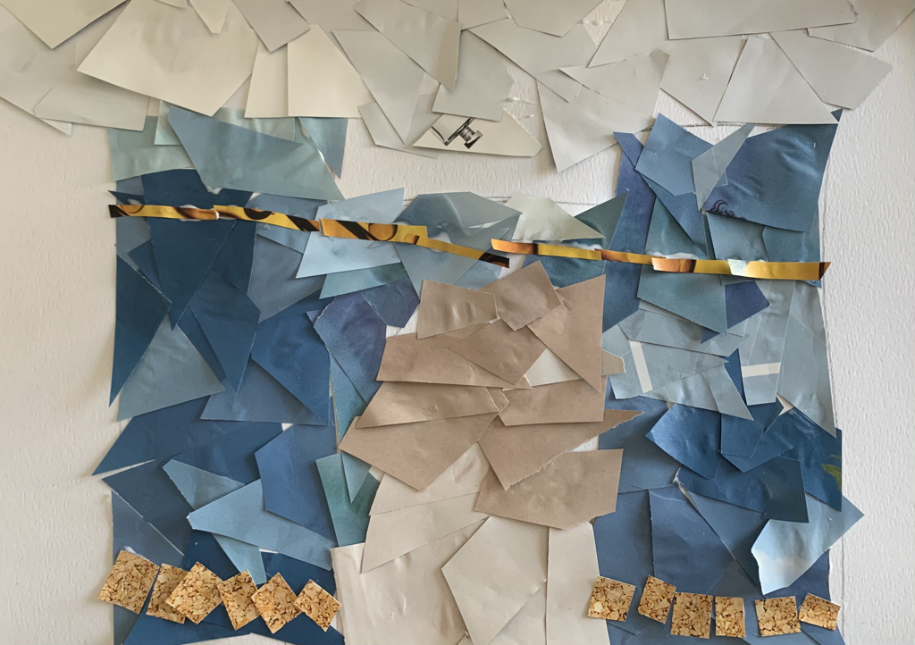 self reflection1. I chose this specific building because it has great historical value to my culture and family.
2. I had the right idea in mind and the right colors, however, I could have constructed it a lot better to show value and proportion. 3. I used pages that had texture to portray the same effect throughout my final piece. 4. I decided on what shapes to cut based on the sections of my building. For the more detailed areas I used smaller pieces. 5. I did not achieve the right idea that I had in mind. There really is no definition in my final project which can definitely be improved. I feel like there can be a lot more work done on the final that could improve it. 6. My craftsmanship was not my best work. I did not deliver the art the way I wanted to. It was not neat or proper in any way. I am aware of that very well and I wish I had spent more time on this project. 7. If I were to redo my project, I would start off by setting up a proper schedule on how to work on the project. I would then illustrate a better sketch to help guide where I would put my pieces. I would then use different shapes and shades to properly create my artwork.
0 Comments
Brainstorming ideas
compositional sketches and references
in progress photos
final drawing/painting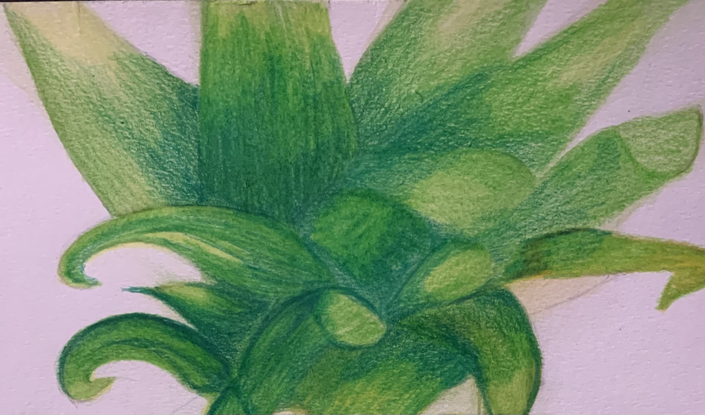 Self reflection1.I used the watercolor as a base for my drawing. This allowed the colored pencils to pop out a lot better. I had to add thin layers of the water color very carefully too.
2.This pretty much set up the success for my final painting. I was struggling trying to let the watercolor do its own thing so I decided to use the transparent layers and add colored pencil on top of them. 3. To begin I wanted to incorporate more of the pineapple into the final. however, due to many complications, I decided it would be best to focus on the leaf part of the pineapple. 4. Yes the color choice was very important. I needed to be sure to add the browns and the yellows with the green. The leaves needed a lot of dimension and they needed to be more than just green. 5. She focused a lot on what the close up of things meant and for me I wanted to make the leaves look like they were fresh and bright. Appealing to being youthful. 6. I was able to make the leaves look very realistic. You cans see where they fold over and the texture within each leaf. 7. I would say that it overall is a well orchestrated piece that took a long time to make. There is a variety of colors and the shapes are well drawn to show the folds and the shadows. 8. I think I would try to add a little more highlights within each leaf. It would make it a little more realistic. 9. I really was frustrated at first because I could not get the watercolor to work with me with anything at all. I tried everything but for some reason I could not figure it out. Knowing I do well with Prismacolors, I went along to put pencil over top my watercolor. The watercolor helped my Prismacolor pop up brighter and it made them blend better as well. The watercolor allowed the yellowed down highlights to pop within each section as well. Colored pencil forms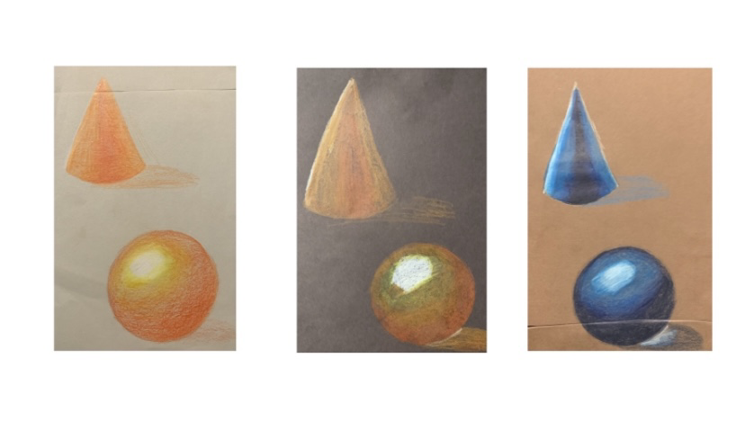 These are colored pencil forms on three different colored papers. The different papers made it easy to learn what different techniques to use on each one. For the cones, I blended things vertically and for the spheres I circled my way around each one. Colored pencil fruit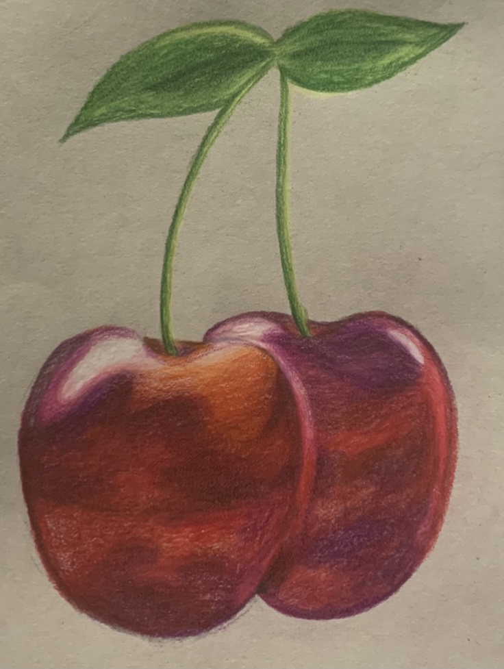 For this project, it was a drawing of either a fruit or a veggie. I choose to draw a pair of cherries. This was super fun because I was able to include different colors to incorporate more realism into them. I added the purples to show that they had been refrigerated for a while. The oranges bring out the little parts that are fresh. watercolor color chart and forms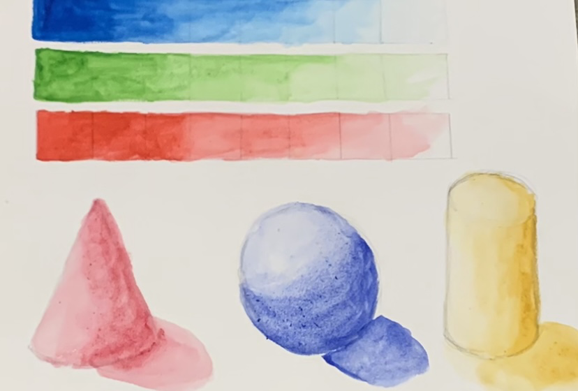 This includes a color chart for three different colors to show blending and color value. This helped me learn how to work with watercolor as I did not have any prior experaince with it. watercolor peppers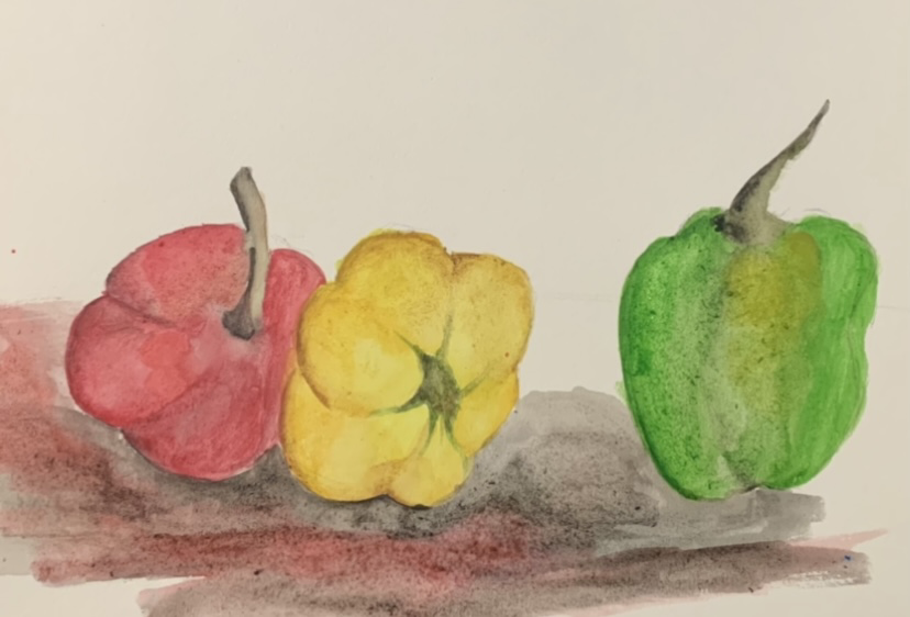 Brainstorming Ideas:
Idea #1 Compositional Sketches
idea #2 Compositional Sketches
Final Drawing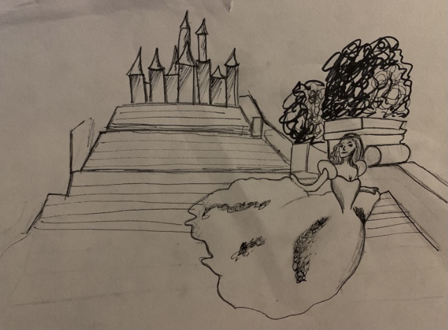 This ended up being my final drawing. It is uncompleted and not my best work. It features no concepts learned in class and it could be very much improved. Self evaluation 1. I strictly used only micron pens. I used the 01,03,05, sizes. This allowed me to have control over the darker areas and be able to create thinner lines. I chose to use horizontal lines to give the illusion of stairs in my final piece. This was an attempt to show realism.
2. I used perspective to show Cinderella in motion. The castle is placed behind her to show her moving away from it. The stairs become smaller as the viewer’s eyes look up higher. This is important because It gives the piece meaning. It shows motion and 3D figures in the art piece. 3.The texture is important because without it everything looks flat. Texture gives the art piece a rich look to it. 4.The value within this project was by far the most important part. The dark and lighter areas allowed the pieces in this project to appear realistic and well thought out. It was a little hard because I wanted this piece to look way darker than what I ended up with. 5.To be fair, this was not my best work. I love my idea and I wish I spent more time on it. The actual composition is very nice and I am proud of it; however, I did not follow through with the final project 6.I would definitely take my time on each section and make sure that I include everything I learned throughout this lesson. I would do my best to draw what I really had in mind. 7.I did Cinderella. I interpreted it in a way that showcased courage and fear at the same time. Cinderella left the castle in secret and did what she wanted to do in the original story. In this piece, I wanted to show that she had fear of running away but still had the courage to do so and leave through the main entrance. 8.It is important to understand the concepts taught in class because that way we are able to fully apply the knowledge to our final piece. Pen unlike pencil is permanent. Therefore it is important to know what you are doing because there really is no going back. 9.This project taught me that I need to pay attention more to my time. I was not able to do my best on this project due to me wanting to do so much with it with such little time. I overworked myself and then ended up hating the entire final project so I simply gave up. This was not my finest moment and will work harder on overcoming this behavior. This project could have been a lot better than what it appears as. 1 POINT PERSPECTIVE
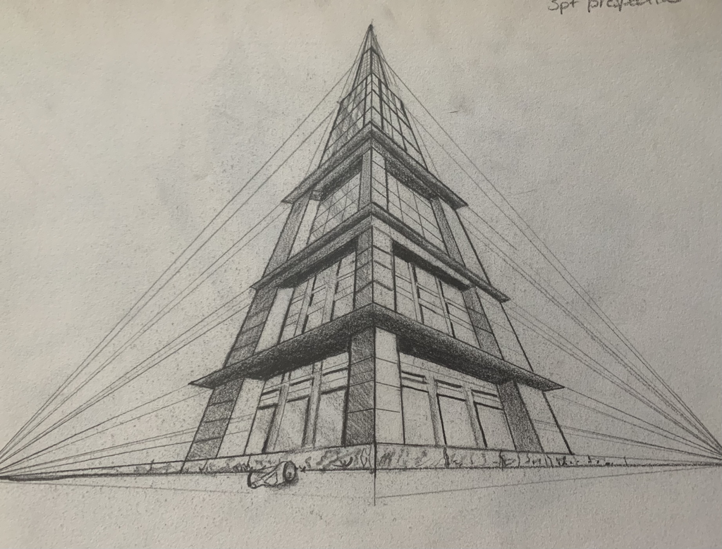
2 POINT PERSPECTIVE
3 POINT PERSPECTIVE
Forced Perspective
Pen and ink value chart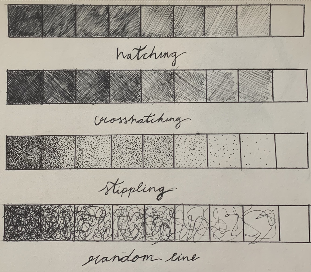 Stippling object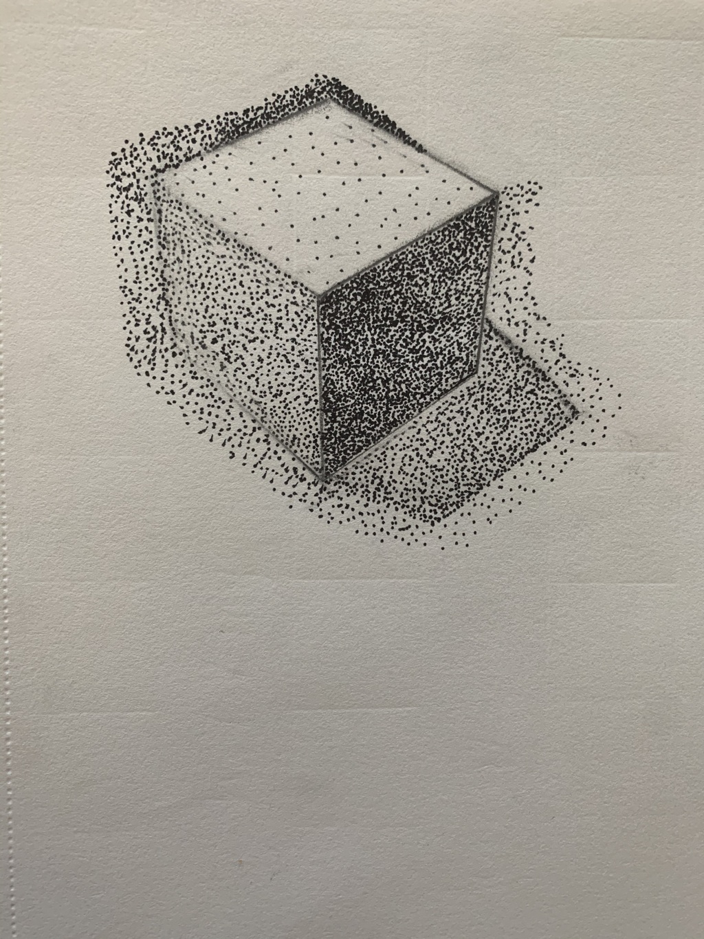
final piece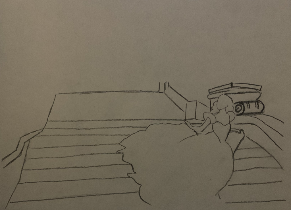 Without the original composition of this drawing, I seriously would have been so lost in setting everything into perspective. The different values in my art piece were structured based on the objects that were around when my reference photo was taken. I choose the inside of my furnace just because of how dark and rich the shadows were. It really pushed me to add those darks while maintaining the pearl whites of the pipes. Then there was the concept of the crisp lines that ran along the sharper casting shadows and the turns of the connectors of the pipes. I tried to slowly begin the slighter outline of everything at first trying to showcase the depth of the drawing as well as maintaining proportions. Learning the prior skills of proper transition between the values was crucial in order for me to successfully complete this assignment. I was able to use all of the different values and transition from darks to lights without smudging my drawing with my fingers which was very hard not to do. As an artist, I was able to further my knowledge in using different values and lines in order to compose a final drawing and having as much detail as possible.
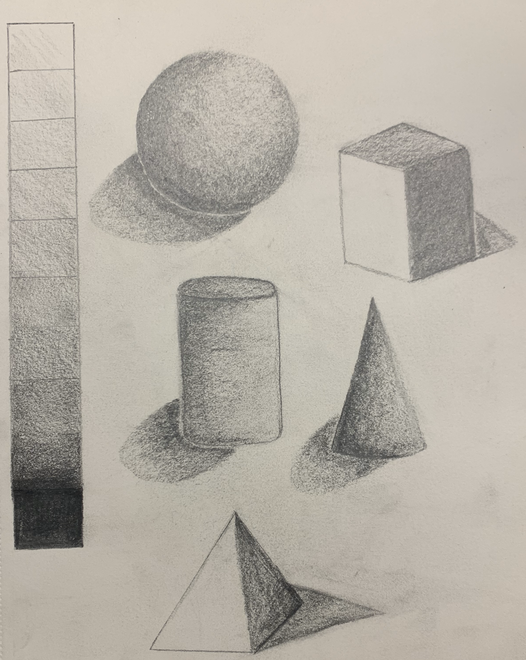 This was a very relaxing and entertaining practice. I was able to improve my shading skills. I learned a lot about using midtones to merge together all of the shades in my shapes. The hardest one to try to make was the pyramid. It was just weird to leave one side completely white. The easiest in my opinion is the sphere. I absolutely love shading in spheres.
 This was the first contour drawing collection I have done in a very long time. I personally do not enjoy just line drawing. I find it much easier to draw objects with range and value as oppose to just drawing the lines that I see. However, this was good practice because it showed me that sometimes I am going to have to draw something that I do not particularly enjoy. These pieces do not look the best and I am not quite proud of them. I know they could have been better.
These three pieces represent what the new "norm" is. I edited them to be in black and white to not only match the mood of the photos, but also to focus more on what is happening in the photos rather than the colors and vibrancy of the edit. The third photo in this project was taken in my apartment hallway. I skewed my photo to the left to show depth and distance through the hallway. Three equally spaced giant sanitizer bottles are placed to show six-feet of space between my best friend and I. The values of the greys to blacks are slightly darker than the other two photos. I did this because I wanted this photo to be the most upsetting showcasing how it felt to stay away from the people I care about the most. The first photo is structured around a hand motion that signifies "asking". Many people were very vulnerable during this global pandemic and we all needed assurance that we were going to be okay. The sanitizer being squeezed into the "asking hands" stands for the hope and information given to us slowly but surely. The second photo revolves around education and where we are all at right now. We are stuck behind the screen for most of our mornings and the only times we can go outside is if we have our masks on. Education has been effected greatly throughout this journey however, the white background gives off a positive vibe to the photo. It is to show the support of our teachers and peers through our current situation. I was able to voice out my opinions and feelings well through these photos. They were very carefully planned and laid out and I am super happy with the outcome of these photos. I learned that one picture can tell so many words. It is important to take multiple photos and NOT DELETE THEM! Instead, edit each one. All three of these photos were actually the ones I thought I was not going to like/use. Instead I ended up only liking those ones.
|
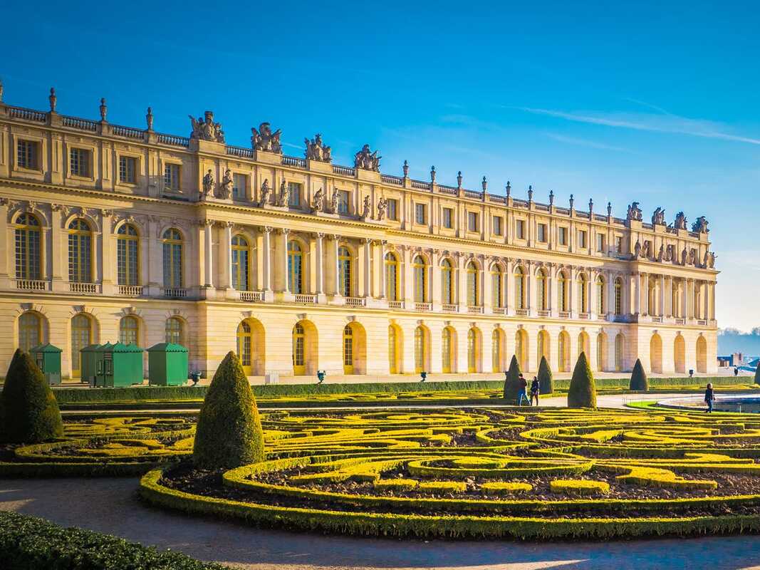
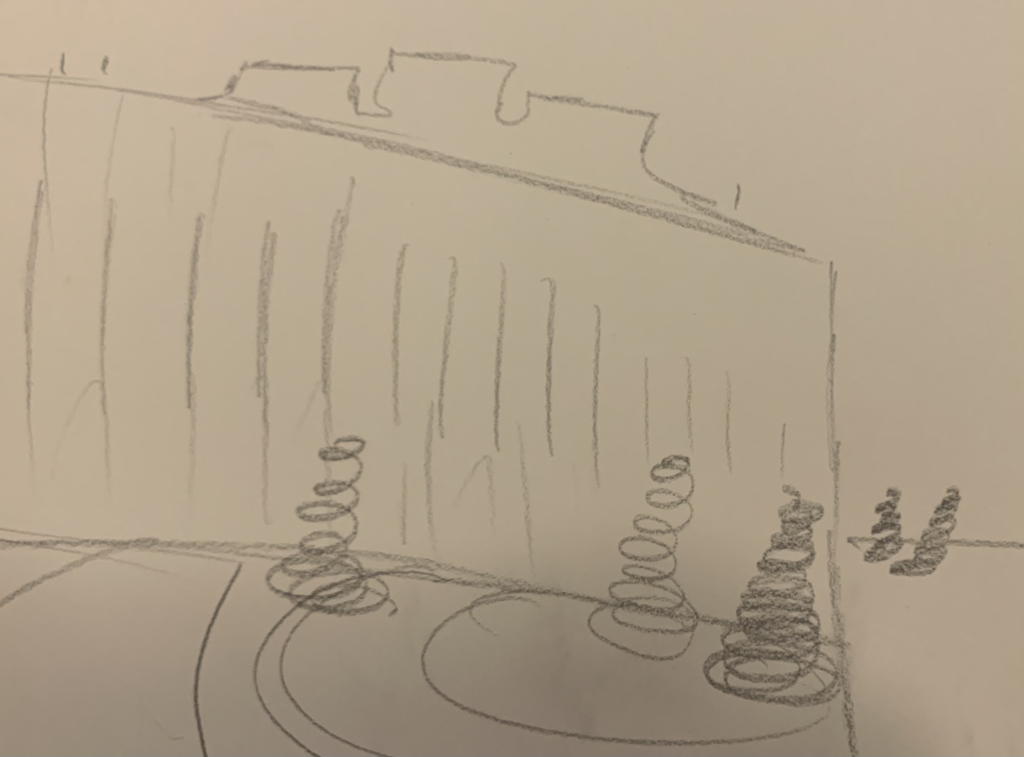
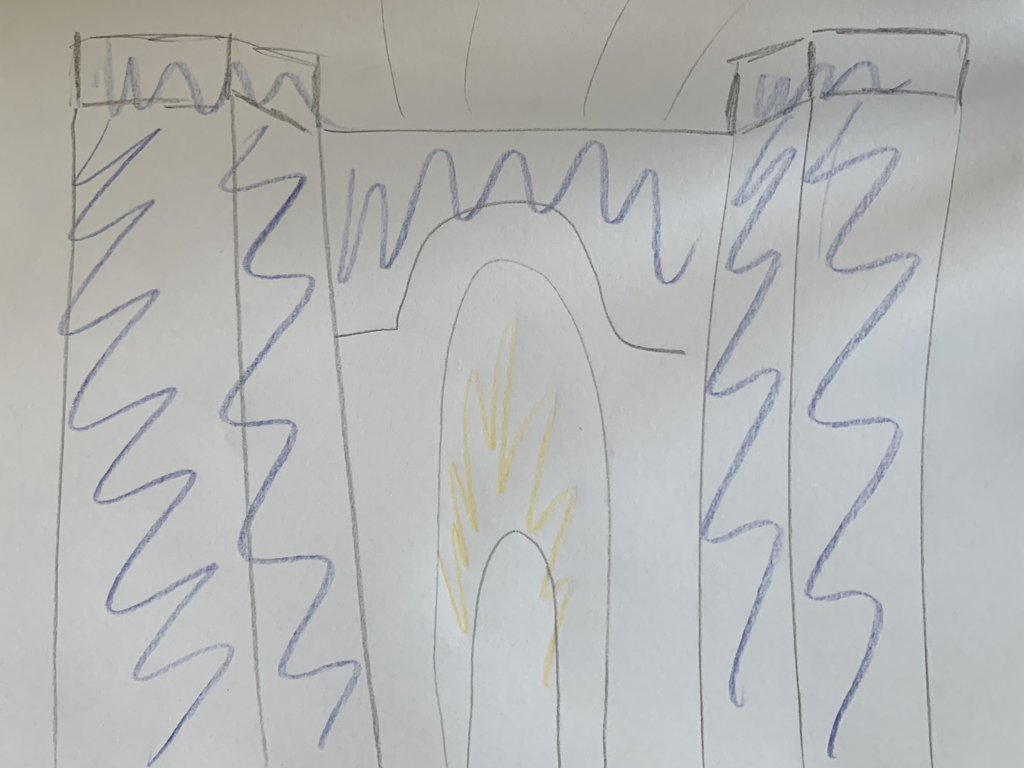
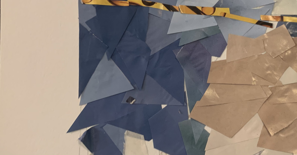
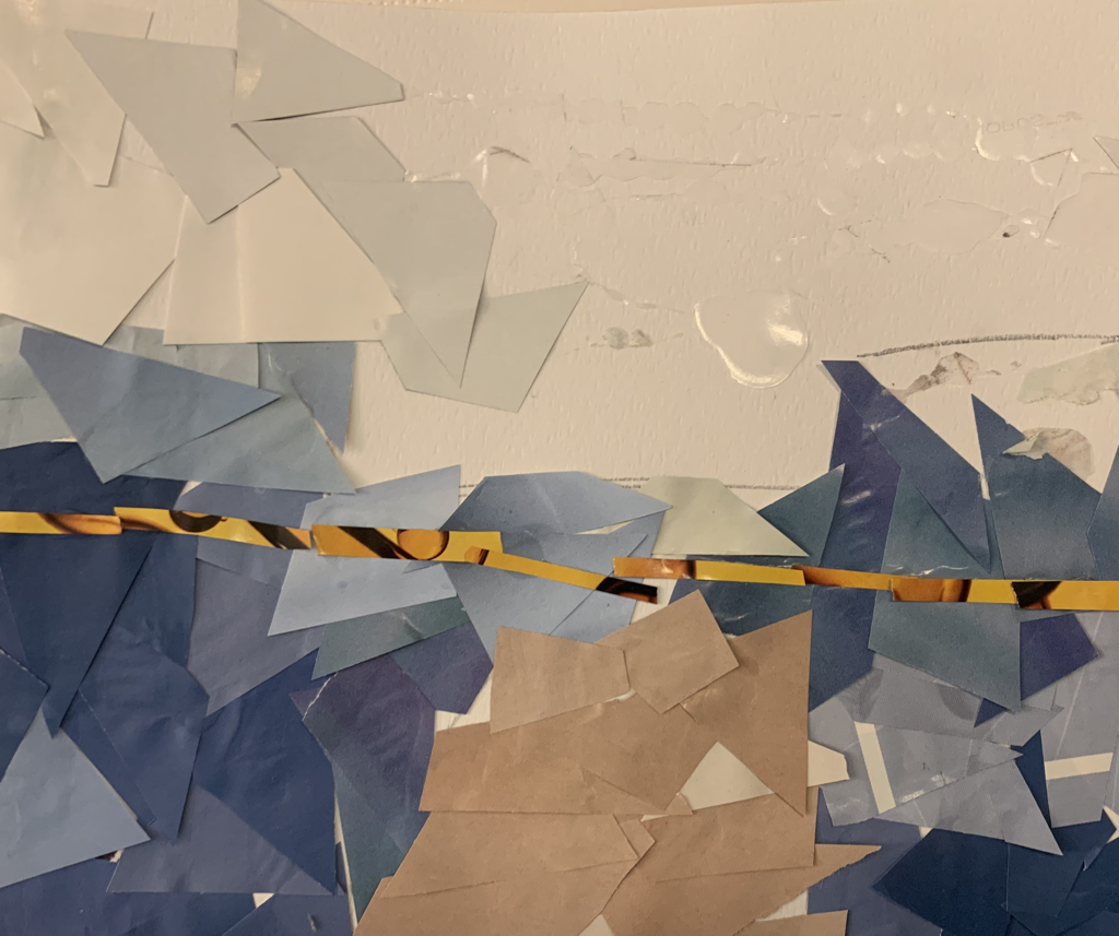
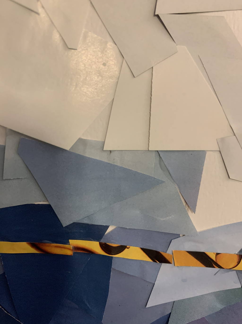
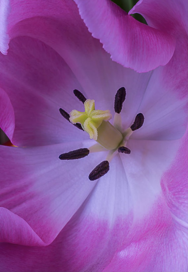
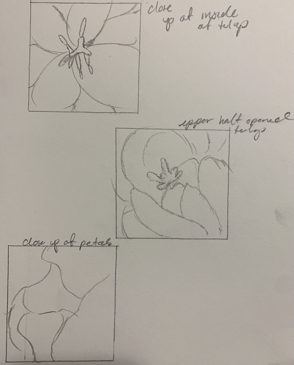
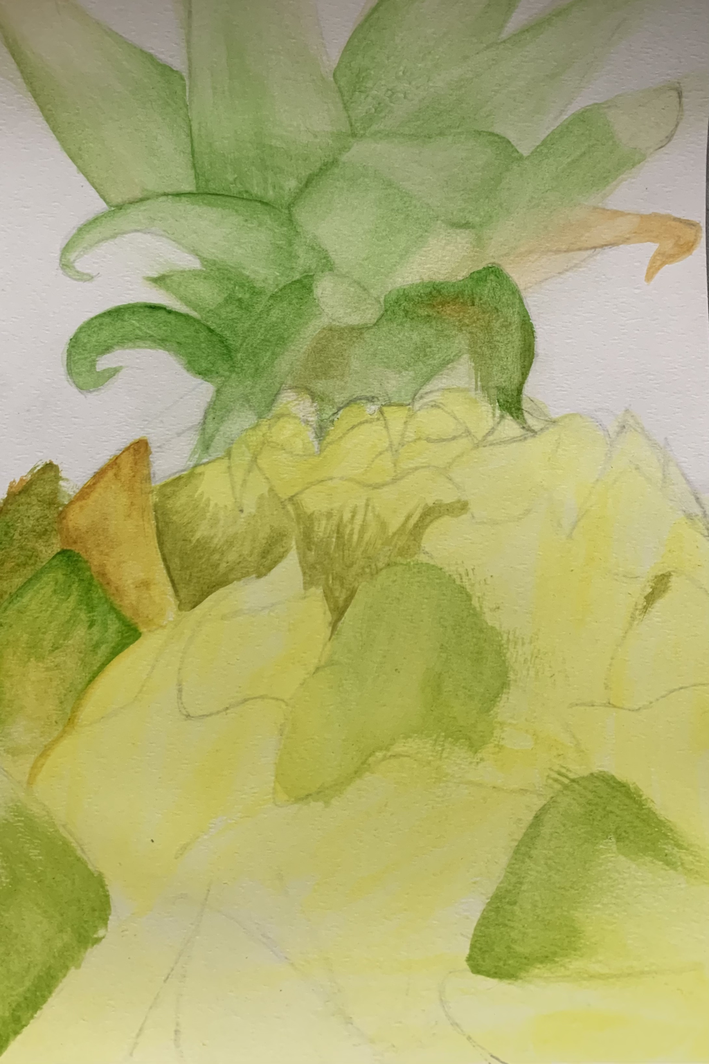
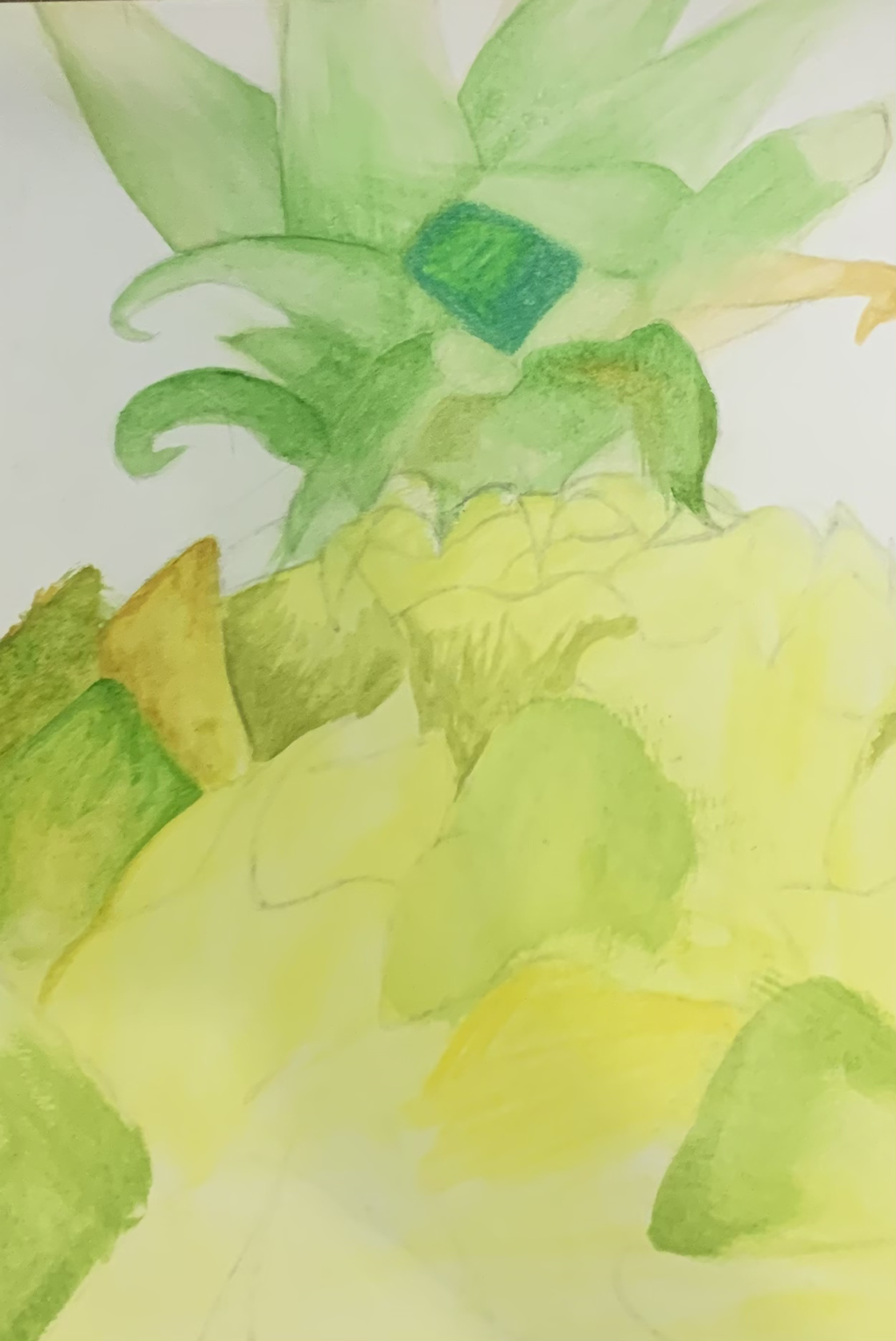
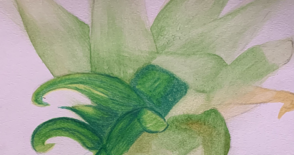
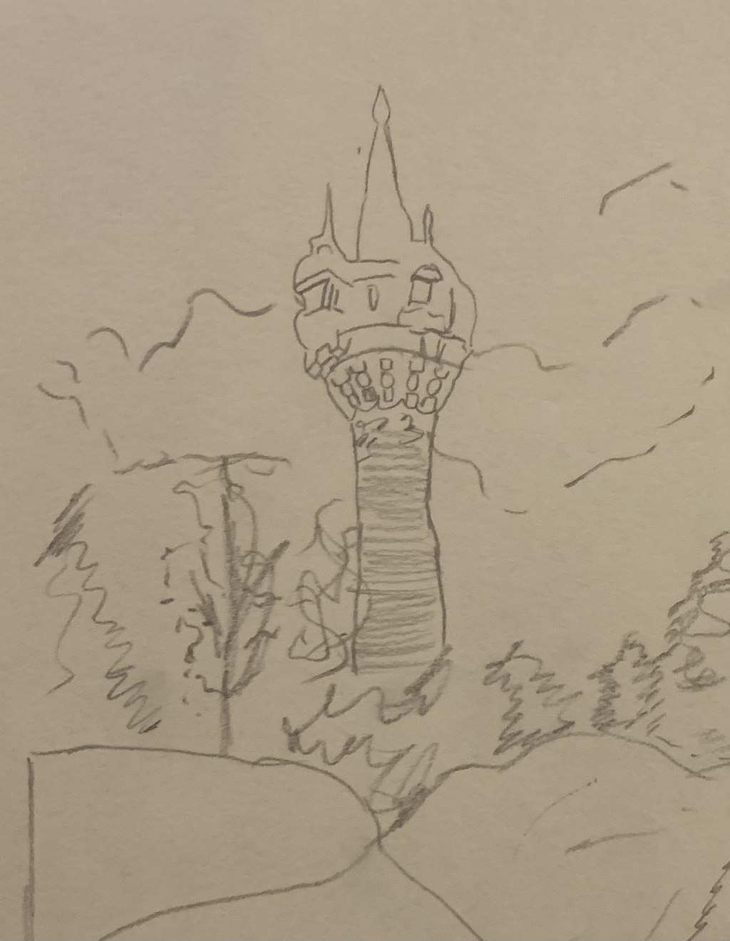
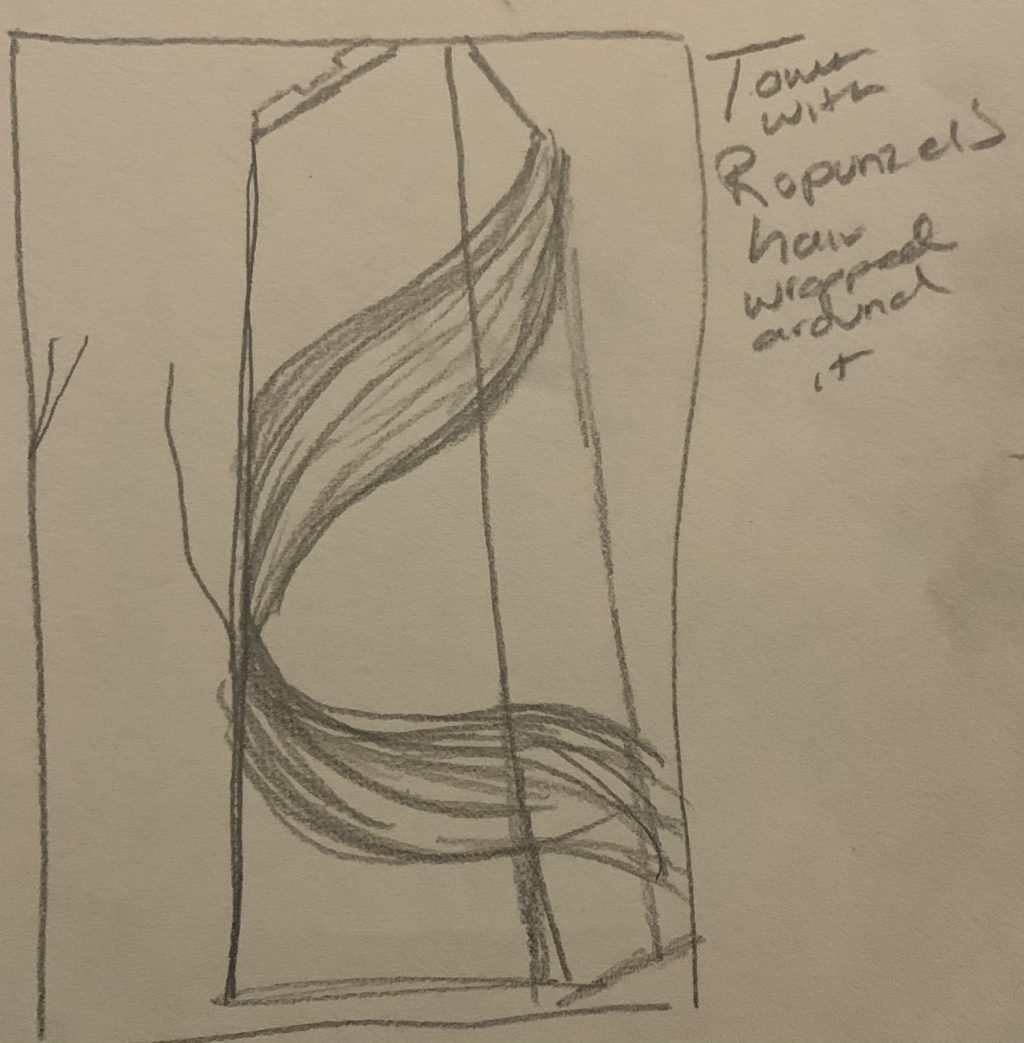
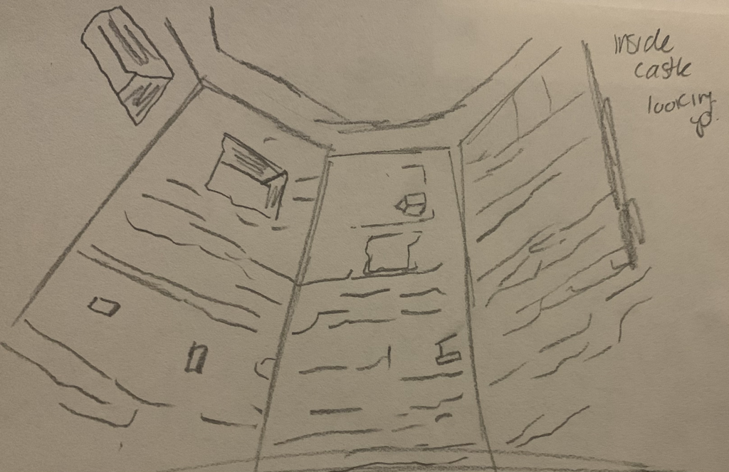
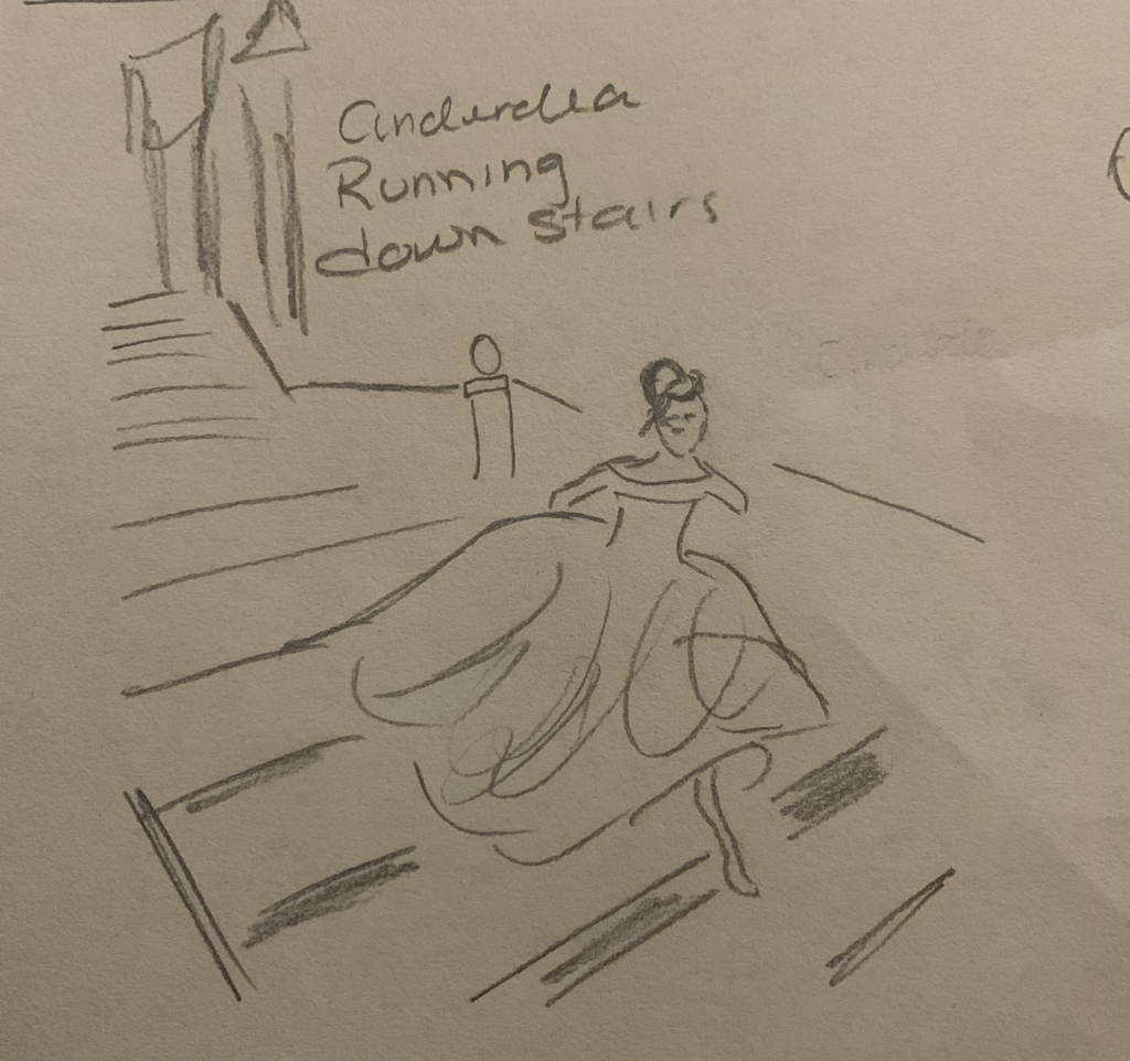
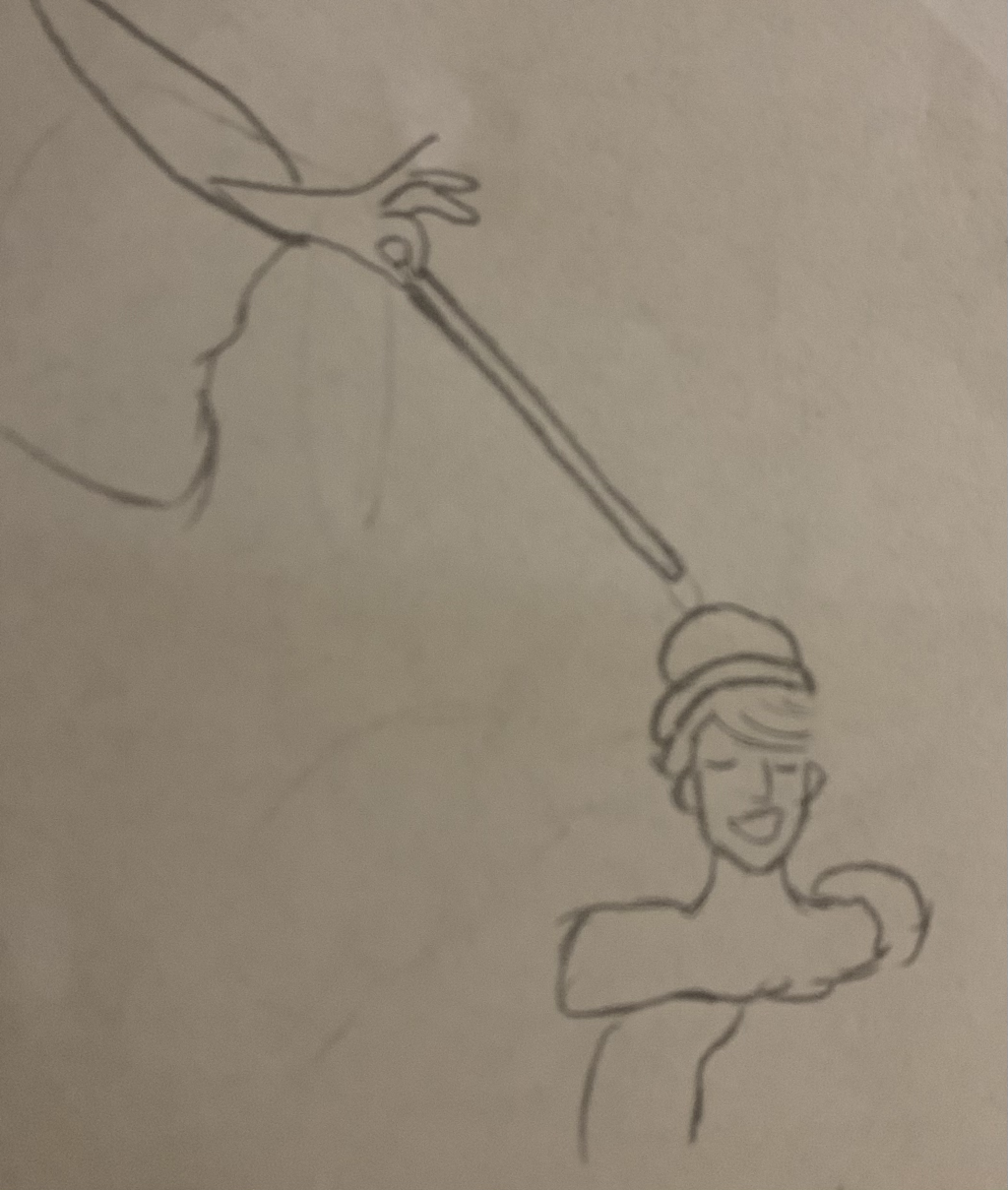
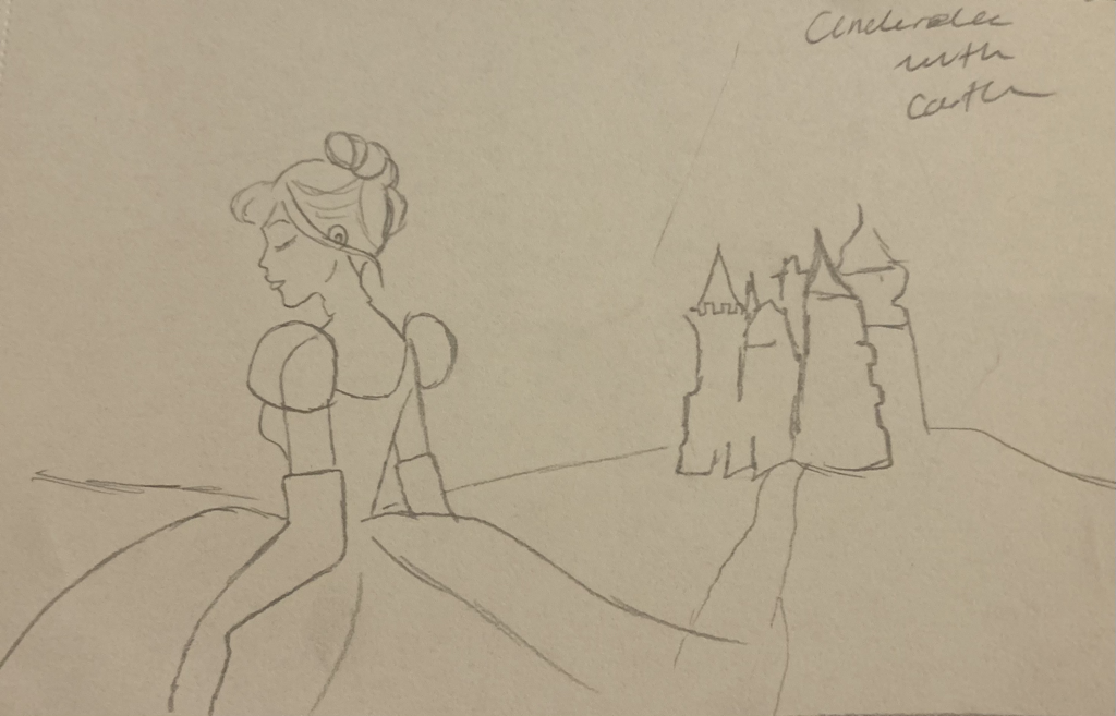
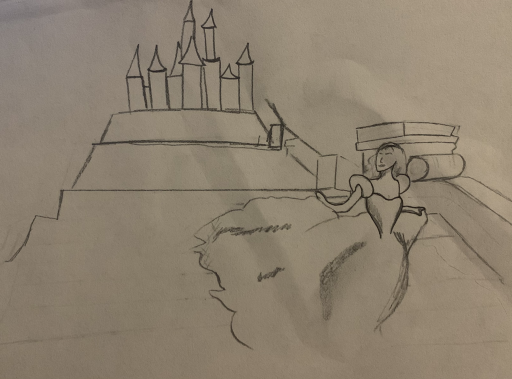
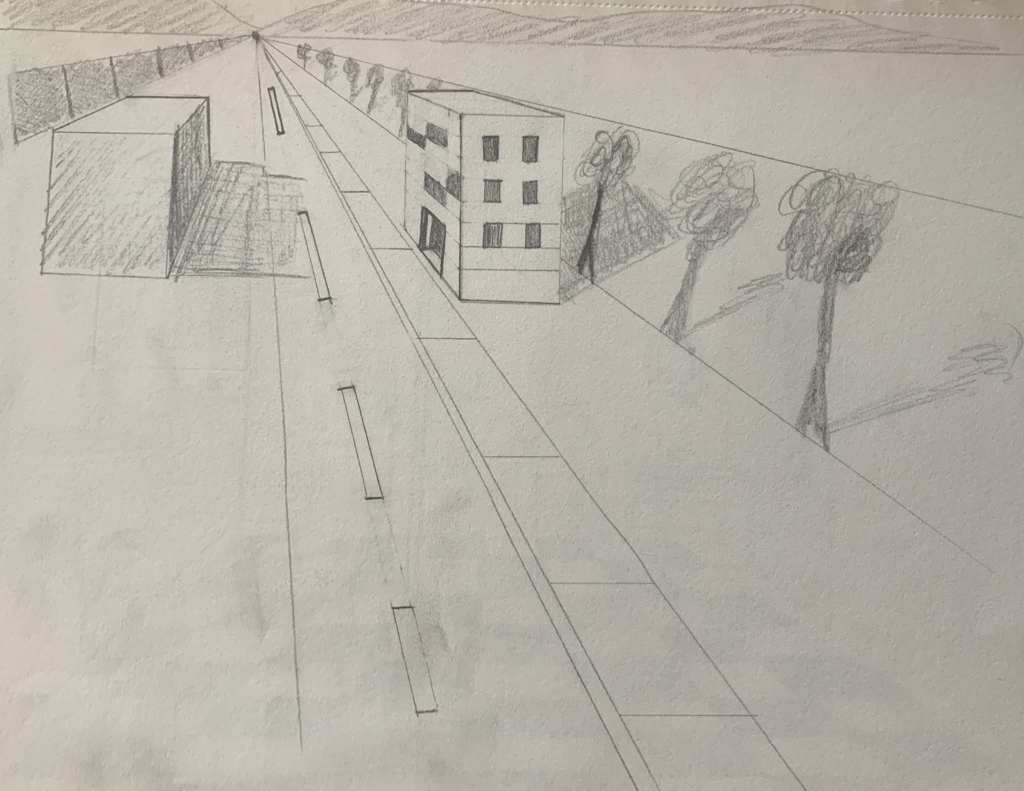
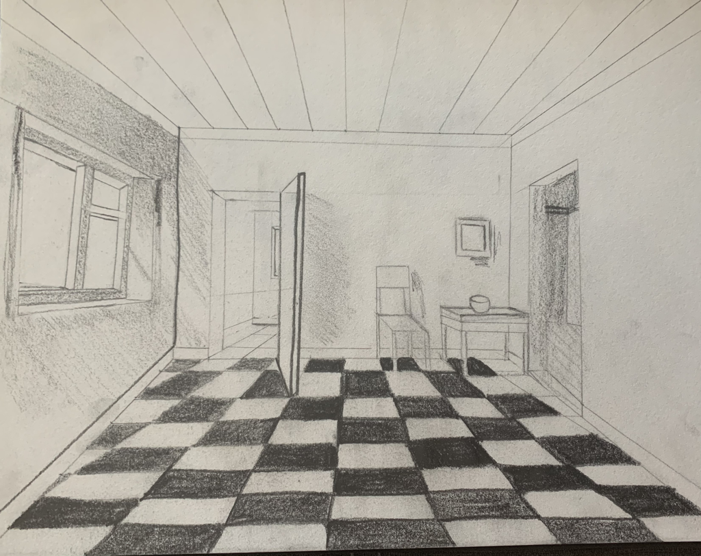
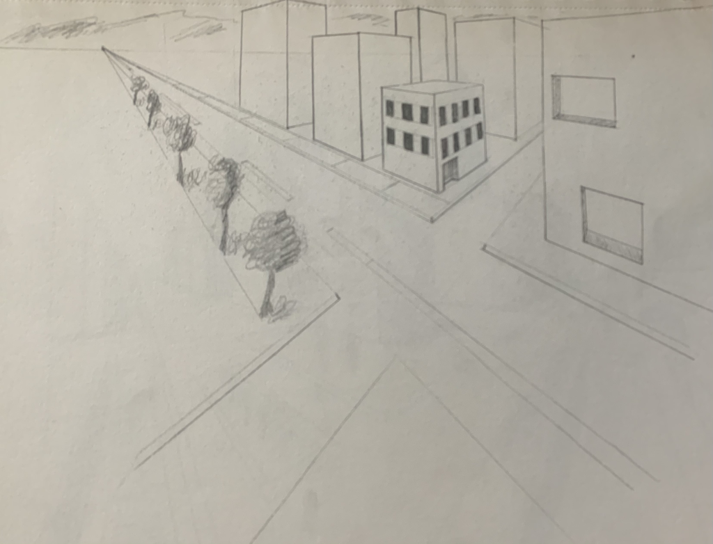
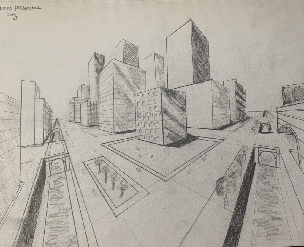
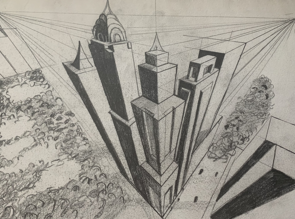
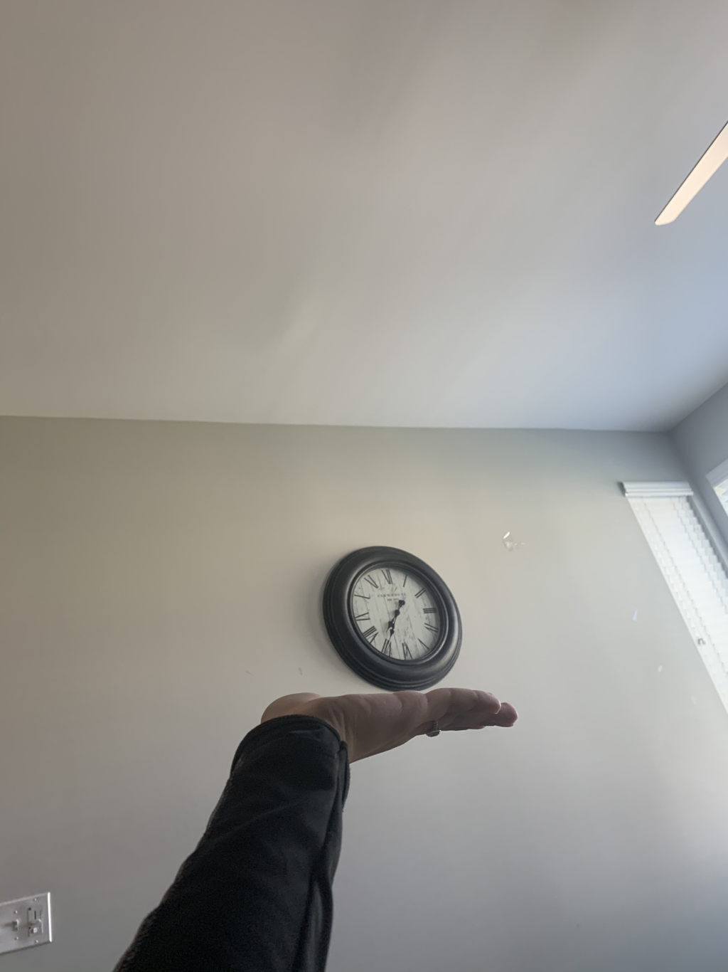
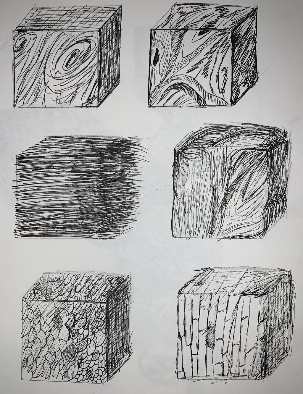
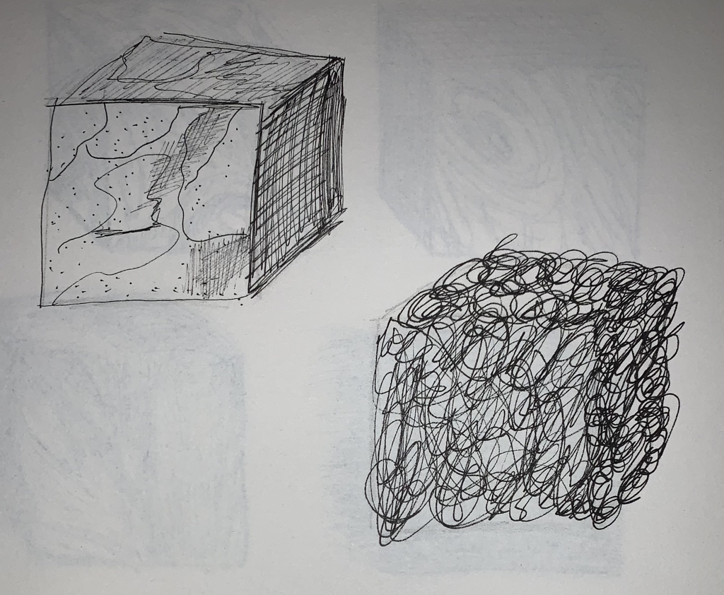
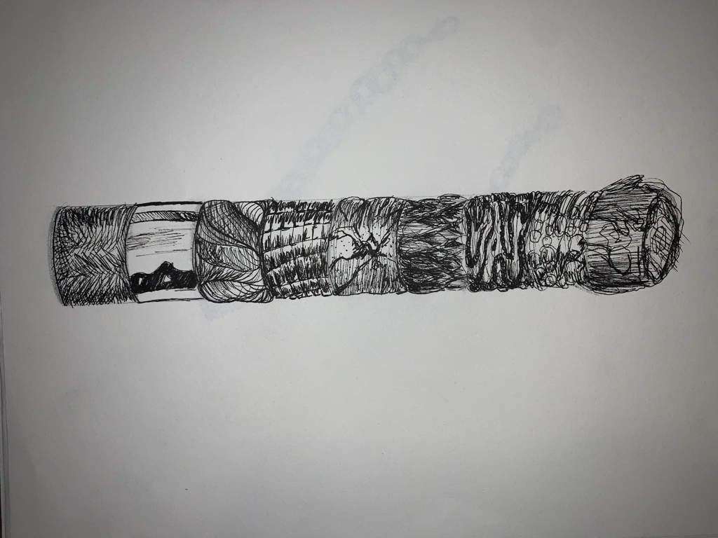
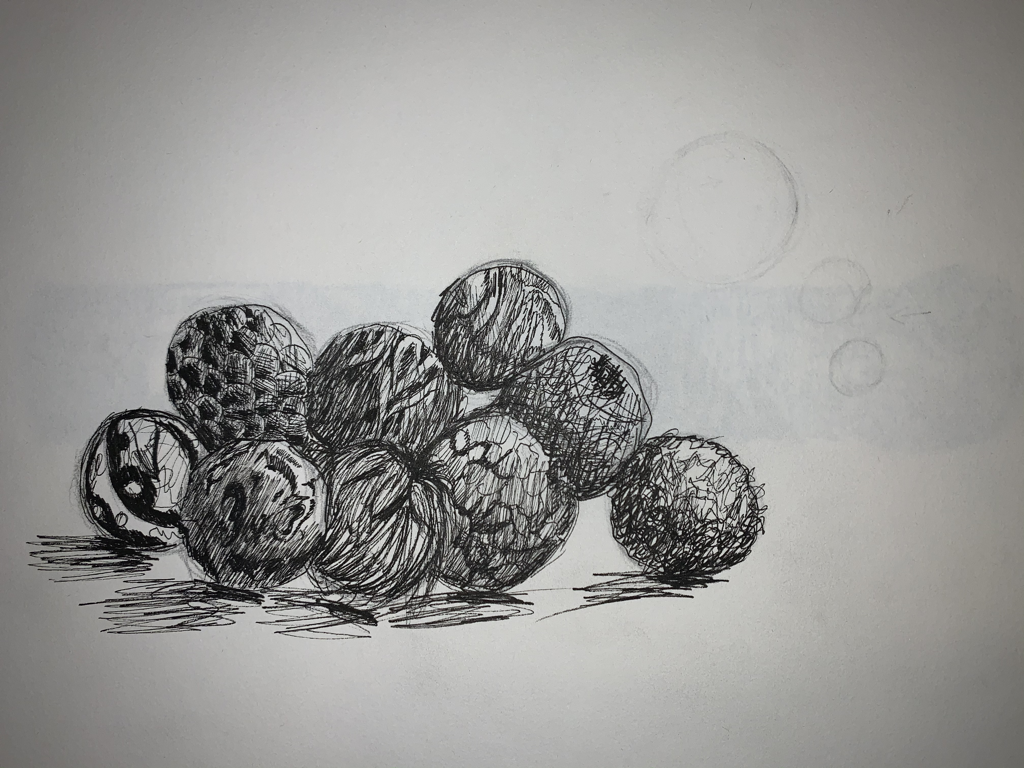
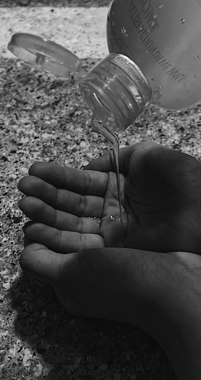
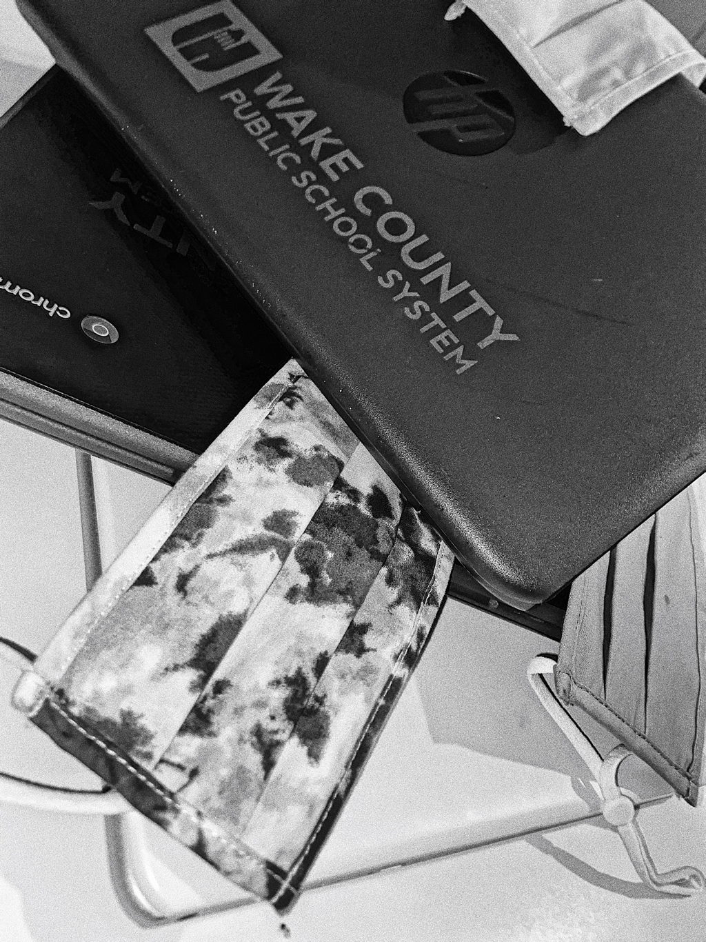
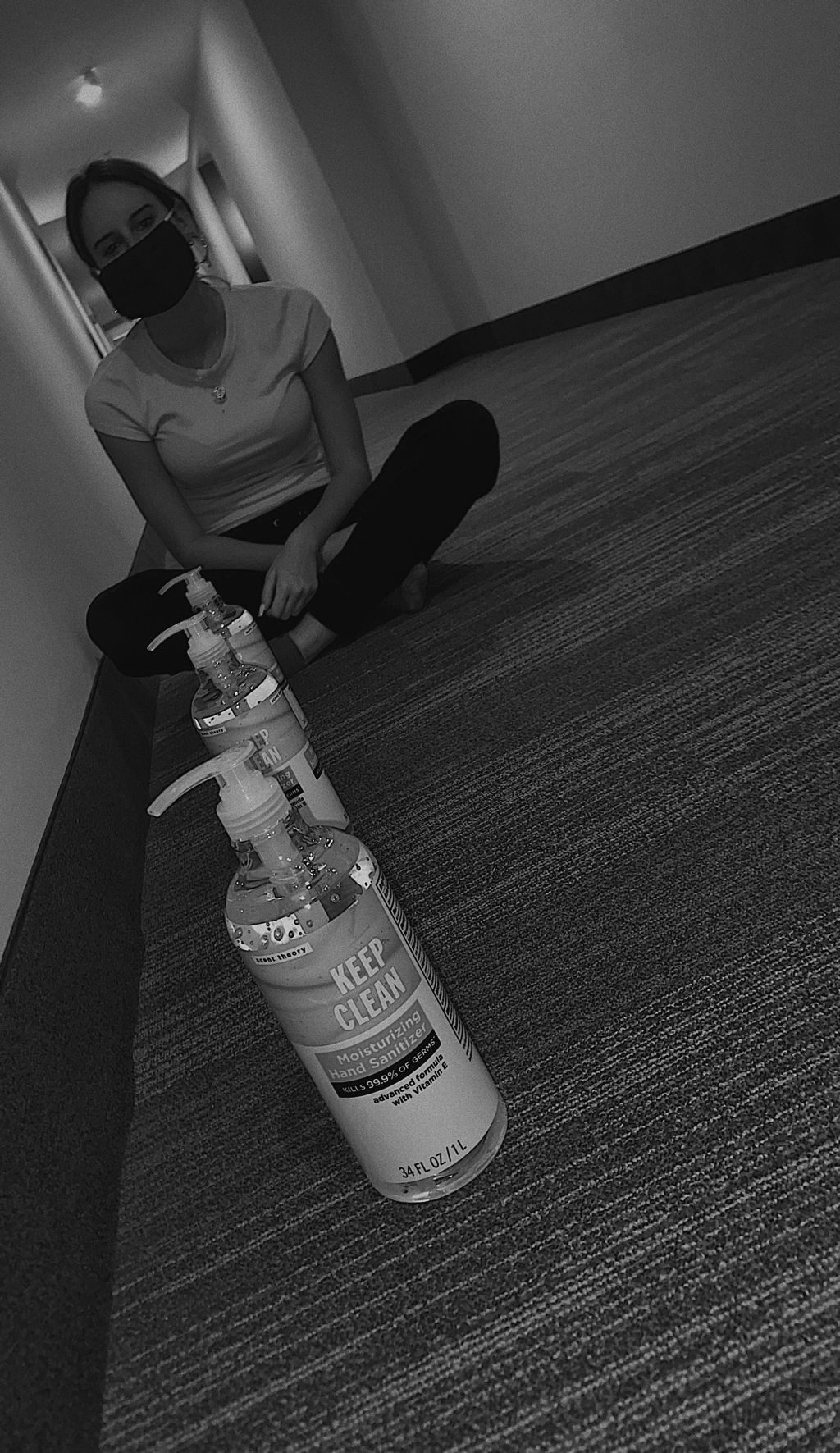
Photo used under Creative Commons from Kenneth Vetter
